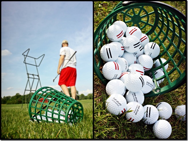
Yesterday after work, we headed our church small group meeting, but we left a little early to stop at Young’s Jersey Dairy to hit some golf balls.
I usually get uber frustrated trying to hit a golf ball, but I was surprisingly patient and just happy to be outside in the sun.
We finished with some time to spare, so we walked over to the dairy barn to see the animals. Nothing too exciting for two people in their mid-twenties, but it was a nice little date away with Eugene on a weeknight.
I mentioned yesterday that we tackled some outdoor projects for the house this weekend. Other than the new roof, our house budget is predominately on indoor fixes, but I was able to squeeze in a couple dollars to add a hint of improvement to our curb appeal.
I’ve been searching for house numbers that aren’t the usual peel & stick paper or plastic kind. I found a few I liked, but they all ran around $30 a piece. Um not gonna work.
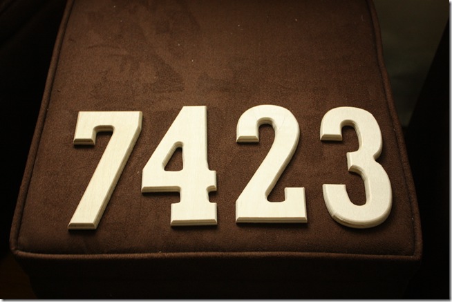
Last week while shopping at Hobby Lobby, I noticed these unfinished, wooden numbers for $0.99 each. Sold. I figured it was worth the try!
I brought ‘em home & hit ‘em with my faithful ORB spray paint {yes, the same can I used for my bathroom faucet!}.
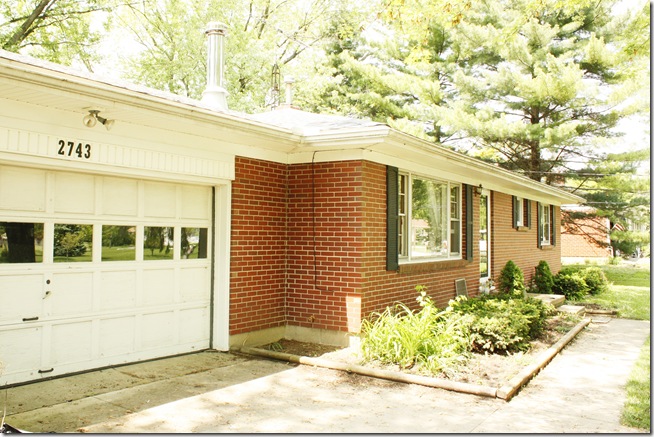
I picked a spot for them above the garage door, although I may end up moving them eventually, {placing them on a plaque and hanging it by the door?} I had to get creative on how to hang them since I didn’t want anything permanent, and screwing the numbers into the vinyl siding wasn’t going to work, so I decided to try the command adhesive strips. Worked like a charm – so far – even after a thunder storm the past two nights.
The only way to tell which house is ours is by really small numbers on our mailbox which is across the street slightly diagonal from our house. So for just four bucks, now people can actually know which house is ours.
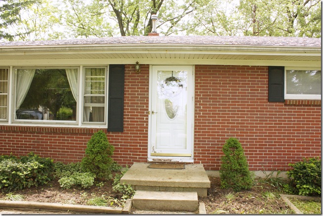
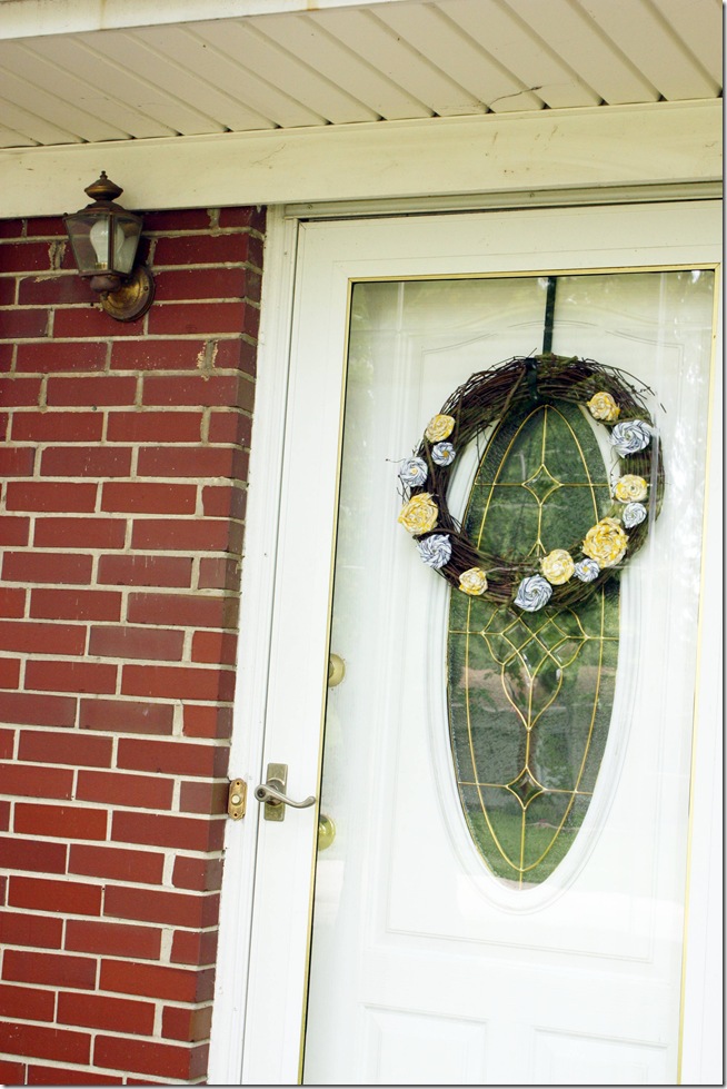
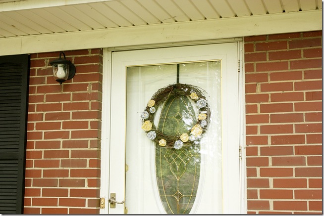
The next curb appeal detail has been a goal of mine since the day we moved it. See it below?
Here, let’s get a little closer… see it now?
How about now?
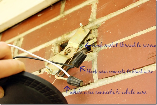
Ugh. Yuck. I hate how high it is, not to mentioned that tarnished gold is not my favorite. I know what you’re thinking, and no, I didn’t spray paint it. It’s beyond the help of spray paint anyway! So I shut off the electricity & went to work on dismantling it, remembering how it was connected so that I could hook up the new fixture easily.
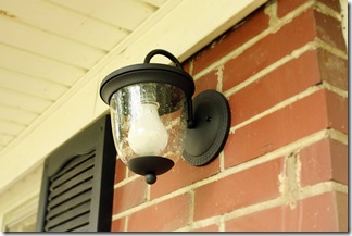
Speaking of the new fixture, I love this guy!
He was only $16 from Lowes, seeded glass and all, and since it hangs downward it doesn’t look as awkwardly high next to the door. :) Ta da!
In case lighting intimidates you like it did me, here’s how simple it can be – it’s just a basic color matching game.
More “after” pics of my new pretty outdoor light….
I tried an energy efficient bulb, but it wouldn’t fit. Hmm.
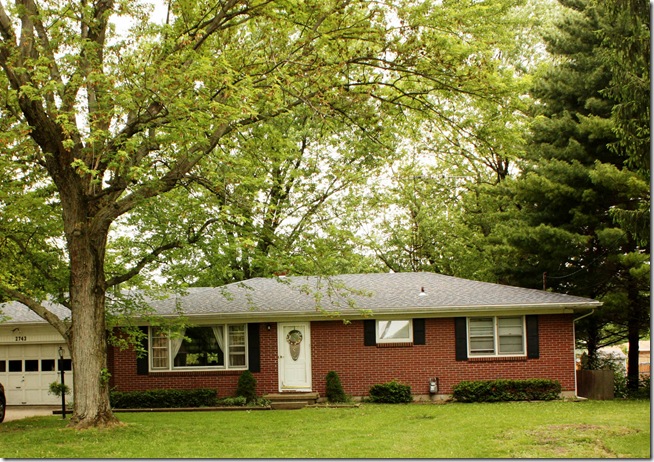
So here’s the house with just a couple curb appeal details.
Twenty bucks, and you can hardly tell from the road, but I still think it makes a big difference in the outside appearance.
Linked to:










It looks great! I would want to get rid of that brass guy, too!
ReplyDeleteSince the energy efficient light doesn't fit, you may want to look into an LED light. We have one on an outdoor fixture that is on 24/7. They take very little energy to run, last a long time, and are very small.
Susan - thanks! I'll have to look at buying an LED light, sound like it's a great option. :)
ReplyDelete